
The first dashboard mistake is assuming another chart will make the business clearer. If the current dashboard does not change a decision, adding more panels usually creates more scanning work without improving the weekly review.
A useful dashboard has fewer surprises: each metric has an owner, a definition, a refresh rhythm, a threshold, and a next action. When those parts are missing, the problem is not design polish. It is decision plumbing.
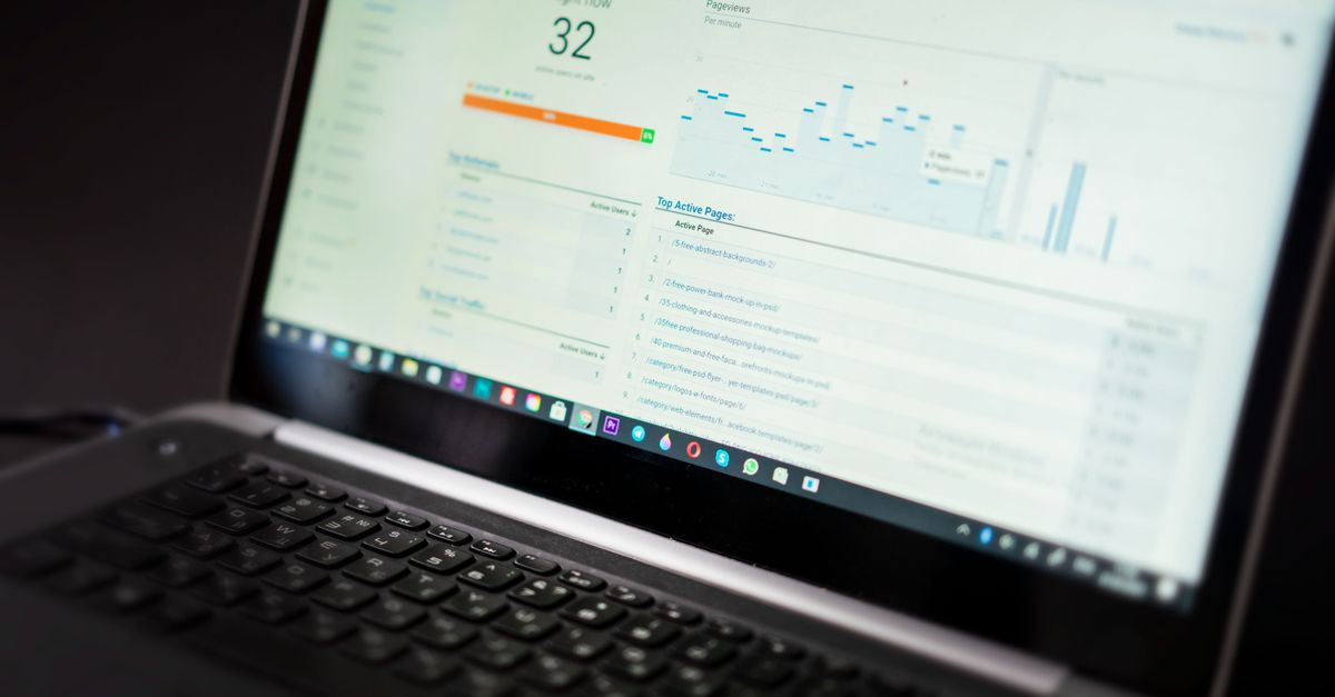
Find The Chart That No One Uses
Start the audit by asking which chart changed a decision in the last month. If nobody can name one, mark it as a candidate for removal or redesign. A chart that looks impressive but has no owner is dashboard furniture, not management information.
For example, a revenue chart may look useful until the team realizes it mixes booked, invoiced, and collected revenue. The weak fix is to add a second revenue chart. The better choice is to define which revenue state supports the weekly decision and label it plainly.
Dashboard Mistakes To Fix First Table
| Check | Evidence | Next move |
|---|---|---|
| Unclear metric definition | Two people explain the same KPI differently during review | Write the formula, source, owner, and excluded cases beside the chart |
| No decision owner | The chart is mentioned but no one knows who acts when it moves | Assign an owner or remove the chart from the main dashboard |
| Missing threshold | The team sees a number but cannot say whether it is good, bad, or watchlist | Add target, warning range, and review cadence before adding another visual |
| Stale or mixed data | Refresh timing or source changes are unclear | Mark the data date and separate booked, invoiced, collected, or closed states |
Use Analytics Sources For Definitions
When traffic or conversion data appears in a dashboard, use the Google Analytics dimensions and metrics guide to keep definitions consistent. The SBA management guidance is a broader reminder that reporting should support actual operating decisions, not decorate them.
Easy KPIs has broader setup help in the first KPI dashboard checklist and metric-selection help in the vanity metrics guide. This article is the cleanup pass before a team expands the dashboard.
Worked Example: One KPI Before Three Charts
Take a support dashboard where response time, resolution time, and satisfaction are all shown, but the team only has capacity to fix one bottleneck this month. The weak version adds trend lines to all three. The better choice is to pick response time, define the start and stop event, set a warning threshold, and assign the support lead to review exceptions every Friday.
After two weeks, the team can ask a sharper question: did the Friday review reduce the number of old unanswered tickets? If not, the dashboard needs a better action path, not a new visualization library.
The audit should happen in the same room as the review, not as a separate design exercise. Open the dashboard during the weekly meeting and pause at each chart long enough to ask what action it supports. If the answer is a story about curiosity rather than a decision, the chart can move to an appendix or backlog.
Small teams also need to mark the difference between leading and lagging measures. Monthly revenue, churn, or profit may be important but slow. A weekly dashboard may need earlier signals such as open proposals, overdue invoices, response time, or qualified leads. The fix is not more metrics; it is choosing the metric that can still change the month.
Add Charts Only After The Review Works
A good audit removes noise before it adds scope. Keep the charts that have definitions, owners, thresholds, and recurring decisions. Park the rest until someone can name the action they support. The dashboard will feel smaller, but the business will know what to do with it.